---
title: "Styling Vercel's UI SDK with Tailwind: data-slot, state attributes and enter/exit animations"
description: "Style Vercel's new UI SDK with Tailwind v4 and shadcn tokens: data-slot, state attributes, CSS variables and enter and exit animations on four components."
author: "Preet Suthar"
date: "2026-11-13"
tags: "React, UI SDK, Tailwind CSS, shadcn/ui"
url: "https://hextaui.com/blog/style-vercel-ui-sdk-tailwind"
---
# Styling Vercel's UI SDK with Tailwind: data-slot, state attributes and enter/exit animations
> Style Vercel's new UI SDK with Tailwind v4 and shadcn tokens: data-slot, state attributes, CSS variables and enter and exit animations on four components.
Canonical: https://hextaui.com/blog/style-vercel-ui-sdk-tailwind
Last updated: 2026-11-13
By Preet Suthar · 2026-11-13 · 9 min read
Vercel Labs published UI SDK to npm on 12 November 2026. It is a set of unstyled, accessible components for React, Vue, Svelte, Solid and Web Components, built on a core library of behaviors. The components handle focus, keyboard and ARIA. How they look is your job.
This post styles four of them with Tailwind CSS v4 and shadcn-style theme tokens: a Select, a Popover, a Rating and a Color Picker. Each one shows a different styling hook. Every snippet below runs in a scratch app built with Vite 8, React 19.3, Tailwind CSS 4.3 and `@ui-sdk/react` and `@ui-sdk/core` at **0.1.0-beta.1**. UI SDK is in beta, and its docs say APIs may still change, so check the version you install.
## How styling works in UI SDK
UI SDK has three layers. `@ui-sdk/core` holds behaviors such as roving focus, typeahead and popups. A primitive, written with `definePrimitive`, combines behaviors with state and named slots. A framework adapter such as `@ui-sdk/react` renders each slot as a part you import, like `SelectTrigger` or `RatingItem`.
**Diagram: Where your styles attach in UI SDK.** Behaviors from @ui-sdk/core (focus, keys, selection, popups) are combined by definePrimitive into a primitive with state, an API and slots. The React adapter renders each slot as a part with a data-slot attribute, state attributes such as data-open, and CSS variables such as --transform-origin. Your Tailwind classes or CSS target those three hooks.
Your styles attach to the parts through three hooks:
- **`data-slot`**: every part has one, such as `data-slot="select-item"`. It names the part for global CSS and for agents.
- **State attributes**: `data-open`, `data-highlighted`, `data-selected`, `data-disabled` and so on. Most are present or absent. Some carry a value, like `data-side="top"` or `data-orientation="vertical"`.
- **CSS variables**: values a class can't express, like `--anchor-width` on a popup or `--rating-fill` on a star.
`className` and `style` can also be functions of a part's state, the way Base UI allows. With Tailwind you rarely need that, because v4 has a variant for any data attribute: `data-highlighted:bg-accent` applies while `data-highlighted` is present.
The docs ask you to style these attributes rather than generated IDs, which can change. Each component page has a Styling section and a Data Attributes section that list exactly what each part exposes. That list is the contract.
## Set up Tailwind v4 and the ui-sdk layer
UI SDK needs a little CSS of its own, for example to keep a closed popup hidden. It adds that CSS at runtime in a cascade layer named `ui-sdk`. Declare the layer first in your global stylesheet, above the Tailwind import, so your styles win wherever the page inserts the runtime CSS:
```css
@layer ui-sdk;
@import "tailwindcss";
@custom-variant dark (&:where(.dark, .dark *));
:root {
--background: oklch(1 0 0);
--foreground: oklch(0.145 0 0);
--popover: oklch(1 0 0);
--primary: oklch(0.205 0 0);
--primary-foreground: oklch(0.985 0 0);
--muted: oklch(0.97 0 0);
--muted-foreground: oklch(0.556 0 0);
--accent: oklch(0.97 0 0);
--border: oklch(0.922 0 0);
--input: oklch(0.922 0 0);
--ring: oklch(0.708 0 0);
}
@theme inline {
--color-background: var(--background);
--color-popover: var(--popover);
--color-accent: var(--accent);
--color-muted: var(--muted);
--color-ring: var(--ring);
}
```
The full token list is the one shadcn/ui generates, with a `.dark` block that overrides the same names. I trimmed it here. Nothing in UI SDK reads these tokens. They only matter because the classes below use them, which means a UI SDK component and a shadcn/ui component can share one theme.
There is no provider to mount and no stylesheet to import from the package. If you use a Content Security Policy without `'unsafe-inline'` for styles, read the CSP section of the Styling and Animation guide, because the runtime CSS needs a nonce or constructed style sheets.
## Select: state attributes and an animated list
A Select has a label, a trigger, a value, a content popup and items. This one shows a role picker with a check mark on the chosen item and a short scale-and-fade when the list opens and closes:
```tsx
import {
Select,
SelectContent,
SelectItem,
SelectItemIndicator,
SelectLabel,
SelectTrigger,
SelectValue,
} from "@ui-sdk/react/select"
const roles = [
{ value: "viewer", label: "Viewer" },
{ value: "editor", label: "Editor" },
{ value: "admin", label: "Admin" },
]
function RoleSelect() {
return (
)
}
```
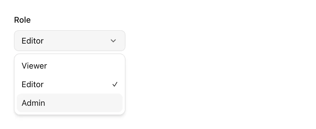
What each class reads:
- `data-open:bg-accent` keeps the trigger tinted while the list is open.
- `data-placeholder:` styles the trigger while nothing is selected. With a default value it never applies here, but it costs nothing to keep.
- `min-w-(--anchor-width)` makes the list at least as wide as the trigger. Tailwind v4 writes a CSS variable value as `(--name)`, without `var()`.
- `origin-(--transform-origin)` scales the list from the side it opens on. UI SDK sets that variable on the content.
- `data-highlighted:` marks the item under the pointer or keyboard focus. Selected items get `data-selected`, and `SelectItemIndicator` only renders inside a selected item.
Passing `items` is optional, but the docs recommend it: the trigger can show the selected label before the list renders, and the agent bridge can read the choices while the list is closed.
If you need to tell keyboard highlight from pointer highlight, the content has `data-modality="keyboard"` or `"pointer"`. A focus ring that only shows for keyboard users is `in-data-[modality=keyboard]:data-highlighted:ring-2` on the item.
## The popup lifecycle
The animation above uses two attributes that exist only during a transition. The content gets `data-starting-style` for its first frame, so a transition has a state to start from. When it closes, it gets `data-ending-style` and stays mounted until the transition or animation finishes.
**Diagram: The attributes a UI SDK popup carries as it opens and closes.** Closed and unmounted. On open, the content mounts with data-starting-style for the first frame, then holds data-open. On close, it gets data-closed and data-ending-style and stays mounted until the exit transition or animation finishes, then unmounts. keepMounted leaves it in the page, hidden.
Three details make this work in practice.
First, put exit styles on `data-ending-style`, not on `data-closed`. `data-closed` describes the state, but the docs are explicit that it does not keep the element around for an exit.
Second, UI SDK popups use the browser's top layer. The content renders in place, as a child of the component, and the browser lifts it above the page. In my scratch app the open content carried `popover="manual"` and matched `:popover-open`. There is no `Portal` or `Positioner` part, and `z-index` does not decide whether it sits above a sticky header.
Third, if an animation library such as Motion needs closed content to stay in the DOM, set `keepMounted`. `onOpenChangeComplete` runs after the open or close finishes, including the animation.
## Popover: a faster exit than entry
Entrances and exits do not need the same timing. A popover that slides in over 200ms and fades out over 100ms feels quicker than one that takes 200ms both ways. Because the exit has its own attribute, Tailwind can give it its own duration:
```tsx
import {
Popover,
PopoverClose,
PopoverContent,
PopoverDescription,
PopoverTitle,
PopoverTrigger,
} from "@ui-sdk/react/popover"
function ShareProject() {
return (
Share
Share project
Anyone with the link can view Atlas.
Copy link
)
}
```
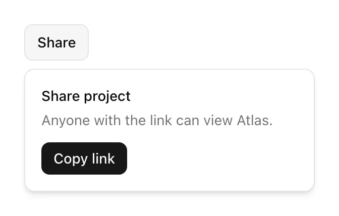
The entrance moves from `-translate-y-1`, `scale-95` and `opacity-0` to the resting state. The exit only scales and fades, with `data-ending-style:duration-100`. `motion-reduce:transition-none` turns both off for people who ask for less motion, and the popover still opens and closes.
`PopoverTitle` and `PopoverDescription` matter beyond looks. The content is a dialog, and these parts give it an accessible name and description. Without a title, give the content an `aria-label`.
## Rating: style the fill, not the stars
A Rating is a radio group drawn as stars. You render one `RatingItem` and the Rating repeats it for each star. Each item reports how much of its star the shown score covers in `--rating-fill`, from 0 to 1. `data-filled` marks whole stars, `data-partial` marks the star a half score ends in, and `data-highlighted` marks the stars up to a score the pointer previews.
`--rating-fill` lets half stars come from one gradient instead of two icons:
```tsx
import { Rating, RatingItem } from "@ui-sdk/react/rating"
const star =
"url(\"data:image/svg+xml,%3Csvg xmlns='http://www.w3.org/2000/svg' viewBox='0 0 24 24'%3E%3Cpath d='M12 2l3.1 6.3 6.9 1-5 4.9 1.2 6.8L12 17.8 5.8 21l1.2-6.8-5-4.9 6.9-1z'/%3E%3C/svg%3E\")"
function StayRating() {
return (
)
}
```

With `step={0.5}`, each half star is its own radio, named "3.5 stars" and so on. The radios are buttons that the Rating places over your icon with inline styles, and the item gets `position: relative` the same way. That is why the span can use `absolute inset-0` without any extra class.
Keyboard works without any work on your side. Focusing the checked star and pressing the right arrow moved the score from 3.5 to 4 in my test, and the fill followed.
### Keep the mask off the focusable item
My first version put the star mask on `RatingItem` itself. It looked right until I tabbed in: a CSS mask clips everything the element paints, outlines included, so the focus ring disappeared. Moving the mask to an inner span fixed it. The item keeps its rounded outline through `has-focus-visible:`, and `[&_button]:outline-none` hides the browser's default ring on the half-width radio button inside, which otherwise draws a thin box around half a star.

This is not specific to UI SDK, but icon-shaped masks are a common way to draw ratings, so it is worth checking with the keyboard before you ship.
## Color Picker: CSS variables do the drawing
The Color Picker exposes the most variables of the four. Every part writes the current color as `--color-picker-color`. The area gets `--color-area-background`, a set of gradients for its two channels, and each slider gets `--color-slider-background`. Your classes give the parts a size and use those variables as backgrounds.
```tsx
import {
ColorPicker,
ColorPickerArea,
ColorPickerAreaThumb,
ColorPickerInput,
ColorPickerSlider,
ColorPickerSliderThumb,
ColorPickerSwatch,
} from "@ui-sdk/react/color-picker"
import { Popover, PopoverContent, PopoverTrigger } from "@ui-sdk/react/popover"
const thumb =
"absolute size-4 -translate-1/2 rounded-full border-2 border-white bg-(--color-picker-color) shadow outline-none ring-1 ring-black/20 focus-visible:ring-3 focus-visible:ring-ring"
function BrandColor() {
return (
Brand color
)
}
```
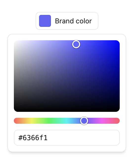
Things worth knowing before you copy this:
- The Popover goes inside the ColorPicker. The parts in the popup and the swatch in the trigger then edit and show the same color.
- `bg-(image:--color-area-background)` is Tailwind v4's type hint. Without `image:`, Tailwind would read the variable as a color, and gradients would not paint.
- The thumbs get `position: absolute` and their place in percent as inline styles. Your class only needs to centre each thumb on its point, which is what `-translate-1/2` does. The slider thumb also needs `top-1/2`, because its inline style only sets the position along the track.
- The swatch is an image to screen readers, named after the color. In my build it was announced as "vivid purple" for `#6366f1`. Name the trigger yourself, because the visible text alone may not say what the color is for.
- For OKLCH, add `ColorPickerAreaCanvas` inside the area. A gradient can't draw OKLCH's gamut edge, so the canvas paints it pixel by pixel.
## Styling by data-slot in plain CSS
Utility classes on every part are one option. The other is a stylesheet keyed on `data-slot`, which keeps markup short and puts a component's look in one place:
```css
[data-slot="select-item"] {
display: flex;
height: 2rem;
align-items: center;
border-radius: calc(var(--radius) - 2px);
padding-inline: 0.5rem;
}
[data-slot="select-item"][data-highlighted] {
background: var(--accent);
color: var(--accent-foreground);
}
[data-slot="select-content"][data-starting-style],
[data-slot="select-content"][data-ending-style] {
opacity: 0;
scale: 0.95;
}
```
The UI SDK docs style their own demos with plain CSS too. It works because `data-slot` is one of the attributes a part always keeps: the docs list it next to roles and `tabindex` as managed attributes that your props can't override. In a shadcn/ui-style project, where each component file wraps the parts and adds its own classes, utilities on the parts are usually simpler. A plain-CSS theme is easier to swap wholesale.
## Moving shadcn-style classes from Radix or Base UI
If your components come from shadcn/ui, most of your classes carry over. The differences sit in a few attribute names and in the popup structure.
| Concern | Radix | Base UI | UI SDK |
| --- | --- | --- | --- |
| Open state | `data-[state=open]:` | `data-open:` | `data-open:` |
| Enter styles | keyframes on `data-[state=open]` | `data-starting-style:` | `data-starting-style:` |
| Exit styles | keyframes on `data-[state=closed]` | `data-ending-style:` | `data-ending-style:` |
| Transform origin | `--radix-popover-content-transform-origin` | `--transform-origin` | `--transform-origin` |
| Trigger width | `--radix-popover-trigger-width` | `--anchor-width` | `--anchor-width` |
| Popup parts | `Portal`, `Content` | `Portal`, `Positioner`, `Popup` | `Content` only |
Coming from Base UI, the attribute names for popups are the same, so the class strings mostly paste across. You delete the `Portal` and `Positioner` wrappers and move placement props such as `side`, `align` and `sideOffset` onto the content. Coming from Radix, you replace `data-[state=…]` variants and keyframe animations with the starting and ending attributes. Either way, check each component's Data Attributes list, because names that look shared can differ. Base UI's Select, for example, has its own attribute set, and so does UI SDK's.
The comparison of the three libraries as a whole, beyond styling, is in [UI SDK vs Base UI vs Radix](https://hextaui.com/blog/ui-sdk-vs-base-ui-vs-radix).
## What tripped me up
A short list, so you don't repeat it:
- **Styling `data-closed` for an exit.** Nothing animates. Use `data-ending-style`.
- **Forgetting `@layer ui-sdk;`.** Without it first, the runtime CSS can land after your styles in the cascade.
- **Masks on focusable parts.** They clip the focus outline. Mask an inner element.
- **Reading `--available-height` from a child.** The docs note it doesn't inherit. Copy it on the popup, for example `[--list-height:var(--available-height)]`, and read `max-h-(--list-height)` below.
- **Gradients from variables.** Use `bg-(image:--name)`, not `bg-(--name)`.
UI SDK is a beta, one day old at the time of writing. Everything here worked as documented in 0.1.0-beta.1, and the attribute lists in the bundled docs at `node_modules/@ui-sdk/react/docs/` match what the components rendered. HextaUI is working on a styled UI SDK flavor of its components, separate from the Base UI one, and this post is what I learned building the first pieces.
## Related
- [Make your React app operable by AI agents with UI SDK and WebMCP](https://hextaui.com/blog/ui-sdk-webmcp-ai-agents-react) - Let AI agents read and use your React UI with Vercel's UI SDK: createAgent, snapshot, act, allow, source agent, definePrimitive and WebMCP registerTools.
- [UI SDK vs Base UI vs Radix: which headless library for shadcn-style components?](https://hextaui.com/blog/ui-sdk-vs-base-ui-vs-radix) - Vercel's UI SDK, Base UI and Radix compared for shadcn-style components: model, frameworks, coverage, styling, animation, beta status, license and agents.
- [How to build a one-page checkout in React and Next.js that survives declines and changed prices](https://hextaui.com/blog/one-page-checkout-react-nextjs) - A checkout form is easy. Declines, 3-D Secure, prices that change before Pay and payments that never answer are not. A one-page checkout in React and Next.js.
- [Product variant picker UX in React: sold-out sizes, missing combinations and back-in-stock](https://hextaui.com/blog/product-variant-picker-react) - Colors and sizes look simple until stock lives on each combination. A React variant picker for sold-out sizes, missing combinations, photos, prices and the URL.
- [Shopping cart UX in React: optimistic updates, undo and money in minor units](https://hextaui.com/blog/react-shopping-cart-optimistic-updates) - A React cart that feels instant and stays correct: money in minor units, optimistic quantities with rollback, merged requests, undo and free shipping progress.