---
title: "UI SDK vs Base UI vs Radix: which headless library for shadcn-style components?"
description: "Vercel's UI SDK, Base UI and Radix compared for shadcn-style components: model, frameworks, coverage, styling, animation, beta status, license and agents."
author: "Preet Suthar"
date: "2026-11-13"
tags: "React, UI SDK, Base UI, Radix"
url: "https://hextaui.com/blog/ui-sdk-vs-base-ui-vs-radix"
---
# UI SDK vs Base UI vs Radix: which headless library for shadcn-style components?
> Vercel's UI SDK, Base UI and Radix compared for shadcn-style components: model, frameworks, coverage, styling, animation, beta status, license and agents.
Canonical: https://hextaui.com/blog/ui-sdk-vs-base-ui-vs-radix
Last updated: 2026-11-13
By Preet Suthar · 2026-11-13 · 9 min read
Until this week, picking the primitive layer under a shadcn/ui-style component library meant picking between two options: Radix and Base UI. On 12 November 2026 Vercel Labs published a third, UI SDK, as `0.1.0-beta.1`. It is headless like the other two, but it is built around a different idea, and it ships something neither of them has: a bridge that lets AI agents read and operate the components.
A disclosure before the comparison. HextaUI's components are built on Base UI today, and I am adding a separate UI SDK flavor next to it. I have reasons to like both, so I tried to keep this fair, and every claim below comes from the libraries' docs, their npm metadata, or a scratch app where I built the same component three times.
If you want the Radix to Base UI migration in detail, with every API change in shadcn/ui code, read [shadcn/ui switched to Base UI](https://hextaui.com/blog/shadcn-base-ui-vs-radix) first. This post doesn't repeat it. It adds UI SDK to the picture and asks which one to start from.
## The short answer
- **Pick Radix** if you have a working Radix codebase, your team knows it, and you don't need a component it lacks. It is stable, React-only and MIT.
- **Pick Base UI** for a new React design system you want to ship on stable APIs this quarter. It is the default under new shadcn/ui projects, covers more components than Radix and uses the attribute model most of the ecosystem is moving to.
- **Pick UI SDK** if you need more than React, want components such as Color Picker, Date Picker or Tree without a second library, or want AI agents to operate your UI through structured tools. Accept that it is a beta.
The rest of the post is the evidence.
## The three at a glance
**Diagram: Radix, Base UI and UI SDK at a glance, November 2026.** Radix (radix-ui 1.8.1, MIT): React only, stable, data-state attributes, Portal and Content, no agent bridge. Base UI (@base-ui/react 1.9.0, MIT): React only, stable, data-open and data-starting-style attributes, Portal, Positioner and Popup, no agent bridge. UI SDK (@ui-sdk/react 0.1.0-beta.1, Apache-2.0): React, Vue, Svelte, Solid and Web Components, beta, data-slot plus data-open and data-starting-style attributes, content rendered in place in the top layer, agent bridge and WebMCP tools built in.
All three are unstyled and handle focus, keyboard and ARIA for you. The versions compared are the latest on npm on 13 November 2026: `radix-ui` 1.8.1 (published 12 October 2026), `@base-ui/react` 1.9.0 (9 October 2026) and `@ui-sdk/react` 0.1.0-beta.1 (12 November 2026).
## Three different models
**Radix** ships one primitive per component. A Dialog package gives you Root, Trigger, Portal, Overlay, Content, Title, Description and Close, and that is the unit you work with. The behaviors inside, like focus trapping and dismissal, are internal. The `radix-ui` package bundles them all.
**Base UI** has the same shape: one component, several parts. It adds more public utilities around them, such as `useRender` and `mergeProps`, so you can write your own parts that behave like the built-in ones. It is React-only, built by people who worked on Radix, Material UI and Floating UI.
**UI SDK** splits the layers differently. `@ui-sdk/core` is a TypeScript library of behaviors: roving focus, typeahead, popups, drag and drop, announcements and many more. A primitive combines behaviors with state and named slots through `definePrimitive`. The components you import from `@ui-sdk/react` are primitives rendered by the React adapter, and the same primitives render in Vue, Svelte, Solid and Web Components through their adapters. Its docs pitch this at agents: give an agent tested behaviors and it can build a component the library doesn't ship, like an icon picker or a kanban board.
The practical difference: in Radix and Base UI, a component you need but they don't have is your problem from scratch. In UI SDK, you build it from the same behaviors the built-in components use, and it can join the agent bridge.
## Same popover, three anatomies
I built one popover three times in a Vite app with the same Tailwind classes. Here are the trees, trimmed to the parts that differ:
```tsx
import { Popover as BasePopover } from "@base-ui/react/popover"
import {
Popover,
PopoverContent,
PopoverTitle,
PopoverTrigger,
} from "@ui-sdk/react/popover"
import { Popover as RadixPopover } from "radix-ui"
function RadixVersion() {
return (
Radix
Share project
)
}
function BaseUIVersion() {
return (
Base UI
Share project
)
}
function UISDKVersion() {
return (
UI SDK
Share project
)
}
```
`trigger` and `panel` are shared class strings, and the Radix version uses two small `@keyframes` rules for its enter and exit. The result looks identical in all three:
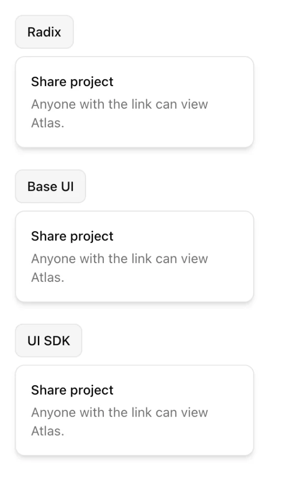
**Diagram: The same popover, three part trees.** Radix: Root, Trigger, Portal, Content. Base UI: Root, Trigger, Portal, Positioner, Popup. UI SDK: Popover, PopoverTrigger, PopoverContent, with the content rendered in place and promoted to the browser's top layer.
What differs is where the content lives. In my test, Radix and Base UI both moved the open content to the end of `` through their Portal. UI SDK left it inside its own component, with `popover="manual"`, and the browser promoted it to the top layer. That has knock-on effects:
- **No stacking fights.** Top-layer content sits above the page whatever the `z-index` of a sticky header or a transformed parent.
- **Events bubble through your tree.** The UI SDK docs warn that a click handler or a link wrapped around a popup also gets the clicks inside it. Keep popups outside clickable cards.
- **Fewer wrapper parts.** Placement props such as `side`, `align` and `sideOffset` go on the content, not on a Positioner.
Radix and Base UI have handled portals well for years, so the first point is less a fix than a simplification. The second point is new behavior you have to know about.
## Styling hooks
All three put state on data attributes, but the names differ, and only one names every part.
| Hook | Radix | Base UI | UI SDK |
| --- | --- | --- | --- |
| Open state | `data-state="open"` | `data-open` | `data-open` |
| Part name | none | none | `data-slot` on every part |
| Transform origin | `--radix-popover-content-transform-origin` | `--transform-origin` | `--transform-origin` |
| Anchor width | `--radix-popover-trigger-width` | `--anchor-width` | `--anchor-width` |
| State in `className` | no | function of state | function of state |
The `data-slot` row matters more than it looks. shadcn/ui adds its own `data-slot` attributes in its wrapper files, because Radix and Base UI don't emit one. In my scratch app, the Base UI popup carried `data-open`, `data-side` and `data-align`, and no `data-slot`. UI SDK sets it on every part itself, like `data-slot="popover-content"`, and the docs treat it as a managed attribute your props can't override. That gives global CSS and agents a stable name for each part.
If you style with Tailwind, moving from Base UI to UI SDK is mostly deleting wrappers, because the popup attribute names are shared. Moving from Radix means replacing `data-[state=open]:` variants and Radix-prefixed variables. The [UI SDK styling tutorial](https://hextaui.com/blog/style-vercel-ui-sdk-tailwind) walks through four components with shadcn-style tokens.
## Animation
**Radix** animates mount and unmount with CSS animations on `data-state`. Its docs say it suspends unmount while the exit animation plays. For JavaScript animation libraries, many parts accept `forceMount` so the library decides when children mount.
**Base UI** adds `data-starting-style` and `data-ending-style`, so CSS transitions work for both directions, not only keyframes. The popup stays mounted until the animation ends, then is removed, or hidden if the Portal has `keepMounted`. Its animation guide covers Motion, and says it detects Motion animations that include `opacity`.
**UI SDK** uses the same two attributes with the same meaning. Content stays mounted until its exit transition or animation finishes, `keepMounted` keeps closed content in the page, and `onOpenChangeComplete` runs when the open or close is done. The UI SDK docs don't have a guide for Motion yet, beyond a note to use `keepMounted` when an animation library needs closed content to stay in the DOM.
For CSS-only animation, Base UI and UI SDK are effectively the same. For Motion-heavy interfaces, Base UI has documented patterns today and UI SDK doesn't.
## Component coverage
Counting components across libraries is rough, because they split and name things differently. As a guide:
- **Radix**: 30 primitive packages in `radix-ui` 1.8.1, from Accordion to Tooltip, plus utilities like Slot, Portal and Visually Hidden.
- **Base UI**: 37 components in its docs index, including Combobox, Autocomplete, Number Field, OTP Field, Drawer, Toast and Preview Card, which Radix doesn't have.
- **UI SDK**: 55 components and two hooks in the docs bundled with 0.1.0-beta.1.
Most Base UI components have a UI SDK counterpart, sometimes under another name: Number Field is Number Input, Preview Card is Hover Card, OTP Field is OTP Input. UI SDK also ships components that neither of the others has, including Calendar, Date Picker, Date Input, Time Input, Color Picker, Rating, Tree, Command, Carousel, Resizable, Image Cropper, File Input, Token Input, Trigger Menu, Timeline and Waterfall.
Count isn't quality. Radix and Base UI components have years of production use behind them. UI SDK's component pages list their tested behaviors line by line, which is a good sign, but a day of public life is not the same as years of bug reports.
## The agent bridge
This is the part only UI SDK has. `createAgent()` from `@ui-sdk/react/agent` connects to every UI SDK component on the page. `snapshot()` lists them with their labels, state and available actions. `act()` calls those actions through each component's API, and your change callbacks see `details.source === "agent"`. `registerTools()` offers the same tools to an agent built into the browser through WebMCP.
Radix and Base UI have nothing like it built in. An agent drives them the way it drives any web page: through screenshots, the DOM or the accessibility tree, with browser tools that click and type.
Vercel's docs include a benchmark of that difference on a project-settings task. By their numbers, with Sonnet through Claude Code and medians of three runs, the agent bridge cut tool calls from 16 to 5 and cost from $0.073 to $0.032. Those are Vercel's figures for one task, not mine, but the direction makes sense: reading a list of components with their state is cheaper than reading a page. I built a working demo of the bridge, with permissions and a custom component, in [Make your React app operable by AI agents](https://hextaui.com/blog/ui-sdk-webmcp-ai-agents-react).
If agents using your UI is not on your roadmap, this section shouldn't decide anything. If it is, nothing else in this comparison comes close.
## Maturity and license
Radix and Base UI are stable 1.x libraries. Their APIs change with semver, and shadcn/ui ships every component for both.
UI SDK says in its README and docs that it is in beta and that the framework, APIs, documentation and behavior may change before general availability. Its beta is covered by Vercel's public beta agreement. Some APIs are marked experimental on top of that, including the `agent` key on custom primitives and the history and undo helpers. The GitHub repository, `vercel-labs/ui`, was created in October 2026, and the only changelog entry is "Introducing UI SDK" on 12 November 2026.
Licenses differ too. Radix and Base UI are MIT. UI SDK is Apache-2.0, which is also permissive and adds an explicit patent grant. If you redistribute it, Apache-2.0 asks you to keep its license and notices, so check with whoever handles licenses at your company if that matters.
## Frameworks
Radix and Base UI are React libraries. UI SDK publishes `@ui-sdk/react`, `@ui-sdk/vue`, `@ui-sdk/svelte`, `@ui-sdk/solid` and `@ui-sdk/web` at the same version, all over one core. If your company runs a React app and a Vue app, or wants a Web Components build for a CMS, UI SDK is the only one of the three that covers all of them with one set of behaviors and attribute names.
UI SDK's React package requires React 19 and React DOM 19 or newer, with `@types/react` 19.2.10 or newer. If you are still on React 18, that decides it for now.
## When to pick each
**Stay on Radix** when the app works, the team knows it, and you aren't blocked. Nothing here forces a move. If you do move, move to Base UI first: it is the smaller step, and the attribute model you learn transfers to UI SDK.
**Start on Base UI** when you are building a React component library or a product UI to ship now. It is stable, it is shadcn/ui's default, and its popups, forms and animation patterns are well documented.
**Start on UI SDK** when one of these is true:
- you need several frameworks to share one component model;
- you need its extra components and would otherwise add libraries for dates, colors or trees;
- agents operating your UI is a product goal, and you want permissions and change sources built in;
- you are prototyping and can absorb breaking changes during the beta.
**Mixing is possible.** UI SDK components don't need a provider, so a Base UI app can use a UI SDK Color Picker on one screen. You carry two dependencies and two sets of attribute names, so keep it to the components you can't get elsewhere.
## What HextaUI is doing
HextaUI's components stay on Base UI. That flavor is what's on the site today, and it isn't going anywhere. I'm also building a separate UI SDK flavor with the same look and theme tokens, for projects that want the agent bridge or the extra components. It isn't released yet. When it is, you'll choose a flavor, not migrate.
## Related
- [Make your React app operable by AI agents with UI SDK and WebMCP](https://hextaui.com/blog/ui-sdk-webmcp-ai-agents-react) - Let AI agents read and use your React UI with Vercel's UI SDK: createAgent, snapshot, act, allow, source agent, definePrimitive and WebMCP registerTools.
- [Styling Vercel's UI SDK with Tailwind: data-slot, state attributes and enter/exit animations](https://hextaui.com/blog/style-vercel-ui-sdk-tailwind) - Style Vercel's new UI SDK with Tailwind v4 and shadcn tokens: data-slot, state attributes, CSS variables and enter and exit animations on four components.
- [How to build a one-page checkout in React and Next.js that survives declines and changed prices](https://hextaui.com/blog/one-page-checkout-react-nextjs) - A checkout form is easy. Declines, 3-D Secure, prices that change before Pay and payments that never answer are not. A one-page checkout in React and Next.js.
- [Product variant picker UX in React: sold-out sizes, missing combinations and back-in-stock](https://hextaui.com/blog/product-variant-picker-react) - Colors and sizes look simple until stock lives on each combination. A React variant picker for sold-out sizes, missing combinations, photos, prices and the URL.
- [Shopping cart UX in React: optimistic updates, undo and money in minor units](https://hextaui.com/blog/react-shopping-cart-optimistic-updates) - A React cart that feels instant and stays correct: money in minor units, optimistic quantities with rollback, merged requests, undo and free shipping progress.